


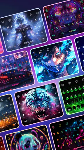
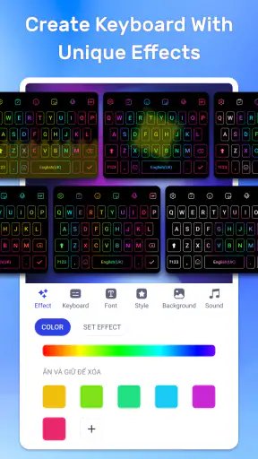
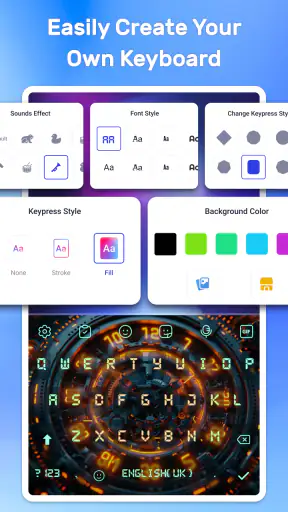
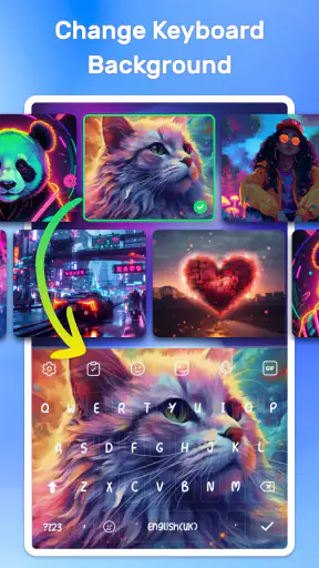
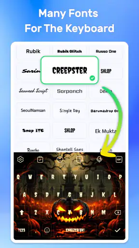
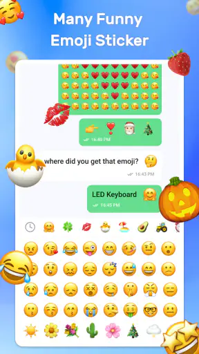
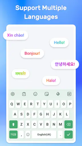
I spent time with LED Keyboard: RGB Themes as a personalization app, and my first impression was straightforward: it is built for people who want their keyboard to feel more expressive than the standard option supplied with their phone. The focus is visual customization, with colorful lighting effects, alternative fonts, emoji access, and high-definition themes gathered around the typing experience.
That narrow purpose is also its main appeal. I would not install it expecting a complete replacement for every keyboard tool or a productivity suite. I would install it because the ordinary keyboard looks dull, because I want a theme that matches my phone, or because I enjoy changing the appearance of everyday interfaces. The app is free to try, rated for Everyone, and works on Android 7.0 or later, which makes it accessible to a wide range of devices.
It comes from highsecure, and its current version is 1.11. The app has reached over five million installs and holds a 4.7 average from around thirty-one thousand ratings, so it has clearly attracted a substantial audience. Those figures tell me that the concept is easy to understand and appealing to many users, but they do not replace personal judgment. A keyboard sits close to almost everything I type, so appearance is only part of the decision.
What the customization feels like in everyday use
The central experience is choosing a look and then living with it while typing messages, searches, notes, and social posts. Instead of treating the keyboard as a fixed utility, the app turns it into a visible part of the phone’s style. RGB lighting is the obvious attraction, but the combination with fonts, emojis, and HD themes gives the customization more range than simply switching between a few background colors.
I found this most enjoyable when I treated the keyboard as part of a larger visual setup. A bright theme can suit a colorful wallpaper, while a restrained design may work better with a dark home screen. The important point is that the keyboard appears repeatedly throughout the day, so even a small change can make the phone feel less repetitive. This is a modest benefit, but it is exactly the kind of small personalization that makes an app like this worthwhile.
The lighting is not just a decorative detail for a single screenshot. It affects how the keyboard feels during repeated use. A vivid RGB style can make short messages more playful, while a busy theme may become tiring when I am writing something long. My practical advice is to test a theme during a normal conversation and during a longer note, rather than judging it only from its preview. A design that looks impressive for a few seconds is not automatically comfortable for daily typing.
Fonts and emojis give the app a second layer of personality. They are useful when I want a message to look different without manually copying unusual symbols from another place. At the same time, I would keep readability ahead of novelty. If the lettering is too decorative or the keys blend into the background, I would switch back to a clearer option. The best theme is not necessarily the most dramatic one; it is the one that remains easy to use when I am typing quickly.
A realistic routine for deciding whether it fits
Imagine checking messages on the way to work, replying to a group chat during lunch, and searching for a recipe in the evening. In that routine, the keyboard is opened many times, but usually for only a few seconds. LED Keyboard: RGB Themes makes those repeated moments more personal without asking me to redesign the entire phone. I can choose a look that feels energetic for casual conversations, then move to something calmer when I need to write a longer message.
That scenario also exposes the trade-off. A flashy keyboard can be fun in a social setting but distracting when I am trying to concentrate. If I use the phone in low light, strong colors may also feel more noticeable than expected. I would therefore keep one practical theme available and treat the more colorful designs as an occasional change. This simple habit makes the app more useful than constantly chasing the most eye-catching option.
Another useful workflow is to choose the keyboard after deciding how much visual information I actually want. If I already use a lively wallpaper, animated-looking icons, and several widgets, a quieter keyboard can prevent the screen from becoming visually crowded. If the rest of the interface is plain, the RGB treatment can provide the accent. Thinking in terms of balance helps avoid the common mistake of selecting a theme in isolation.
Where it differs from a standard keyboard
The usual system keyboard is generally designed around familiarity, speed, and consistency. Its appearance may change with the phone’s theme, but customization is often limited. LED Keyboard: RGB Themes takes the opposite approach by making visual choice the reason to use it. That makes it more interesting for personalization, while the standard keyboard remains the safer choice for anyone who does not want to adjust their typing environment.
A dedicated keyboard from a larger productivity-focused provider may be a better alternative for someone who prioritizes advanced writing assistance, language tools, or a highly established typing workflow. I would choose this app instead when the appearance of the keys matters more than an extensive set of writing features. It is not a universal winner; it serves a different preference.
There is also a difference between changing a wallpaper and changing a keyboard. A wallpaper is mostly observed, while a keyboard is interacted with. That means poor contrast, crowded decoration, or uncomfortable lettering can affect the actual act of typing. I consider this the most important practical distinction: the app’s customization has to remain functional, not merely attractive.
Trust, controls, and moments that deserve attention
Because this is a keyboard app, I approach it more carefully than I would a simple wallpaper tool. A keyboard can appear while I enter private conversations, search terms, addresses, and other sensitive text. I do not treat a colorful design as a reason to ignore that context. Before making it my everyday keyboard, I look at the choices Android presents during setup and at any privacy or permission information shown in the app and system settings.
I also pay attention to whether the app gives me clear control over activation, switching, and removal. A keyboard should not feel difficult to replace. If I want to return to the phone’s original keyboard, I expect to be able to do so through the device’s keyboard settings. This is an important part of user agency, especially when testing a new keyboard for the first time.
The app’s Everyone age rating makes it suitable in the broad sense for general audiences, but that does not mean every user should enable it without thought. Parents may want to check the available choices with a child, while anyone who types work credentials or confidential information should be especially deliberate. The relevant question is not whether the themes are friendly; it is whether I am comfortable using this keyboard in the situations where it will appear.
I would also review any visible account controls, purchase prompts, and settings before settling into regular use. The app is free, but optional in-app purchases range from ninety-nine cents to twenty-two dollars and ninety-nine cents per item. That does not automatically make the purchase model problematic, yet it means I would avoid tapping through customization screens too quickly. I prefer knowing when a design or extra is paid before committing to it.
In my experience, the safest approach is to make choices slowly during the first session. I would examine the keyboard’s settings, check how to switch away from it, and decide whether the visual benefit is worth keeping it active. I would also avoid entering highly sensitive information while I am still evaluating any unfamiliar keyboard. This is not a criticism aimed only at this app; it is a sensible habit for keyboard software in general.
Data-sensitive moments are easy to overlook
The most sensitive moment is not choosing a theme. It is typing. A user may forget that the keyboard is present while entering a password, a private message, a payment-related detail, or a search that they would rather keep personal. I therefore separate casual typing from sensitive typing. For confidential entries, I use the system’s dedicated secure fields and remain aware of which keyboard is active.
Another overlooked moment is switching between keyboards. If I install a colorful keyboard for a quick experiment and then forget that it remains selected, it may appear later in contexts where I did not expect it. I recommend checking the keyboard indicator after installation and again after changing themes. That small check prevents confusion and makes it easier to maintain control.
I would not infer privacy behavior from the app’s appearance, its rating, or its popularity. A polished theme does not explain data practices, and a large install count does not answer every trust question. My judgment is based on what I can actually see in the app and Android’s controls. If a permission request or privacy choice is unclear, I pause rather than assuming it is harmless.
Practical control over the experience
The strongest part of this app’s user agency is the ability to decide how much visual change I want. I can choose a bold RGB presentation, use fonts and emojis for a more expressive style, or favor a less distracting theme. That flexibility matters because different typing situations call for different levels of decoration. I would not use one dramatic design for every context simply because it was the first one I liked.
I also recommend treating the free version as a trial rather than assuming every attractive option is included. Since the app offers purchases, I would explore the available themes first, identify which features genuinely improve my daily use, and only then consider paying. If the only benefit is novelty that fades after a day, keeping the free setup is the better decision.
Device compatibility is another practical consideration. Android 7.0 or newer is supported, so owners of older phones should check their system version before spending time looking for a setup that cannot run. On a compatible phone, I would still judge the keyboard by responsiveness and legibility in my own typing routine, because visual customization is not valuable if it makes ordinary messages slower or less comfortable.
The app is a particularly good match for teenagers, casual users, and anyone who enjoys refreshing a familiar phone interface. It can also suit someone choosing a keyboard to match a fandom-inspired color palette, a seasonal mood, or a personal aesthetic. I would be more cautious recommending it to people who want the most conservative typing environment, who rarely change settings, or who need a keyboard primarily for advanced writing support.
My balanced verdict after using it
LED Keyboard: RGB Themes succeeds because it understands a simple desire: the keyboard should not have to look boring. Its RGB lighting, fonts, emojis, and HD themes give everyday typing a more personal feel, and the app is easy to understand without requiring a major change to the rest of the phone. The free starting point lowers the barrier to trying it, while the broad compatibility and Everyone rating make it approachable for many users.
Its limitations are just as clear. Visual variety does not automatically improve typing, and some designs may be too busy for long messages or low-light use. It also deserves more careful consideration than an ordinary wallpaper because a keyboard appears during sensitive input. I would not enable it casually and forget about it; I would check the visible controls, understand how to switch back, and keep privacy-sensitive habits in place.
For me, the best reason to recommend it is not that it replaces every keyboard alternative. It does not need to. I recommend it when a friend says the phone feels plain and wants a quick, noticeable change that appears every time they type. I would point that friend toward the free experience first, suggest testing a readable theme for a full day, and advise checking purchase prompts before selecting premium-looking options.
If your priority is a lively, customizable keyboard and you are willing to balance style with readability and careful setup, this app is an appealing choice. If your priority is maximum restraint, advanced writing assistance, or avoiding a third-party keyboard altogether, the standard keyboard or a productivity-focused alternative will likely suit you better. My final view is positive but cautious: the visual freedom is genuinely enjoyable, provided you remain in control of what keyboard is active and when you use it.


